Broken Place AR is making leaps of progress! I have officially uploaded the first 0.1 beta to TestFlight and am very close to opening beta to the public. Of all of the progress that I think would be worth highlighting, the interaction system redesign was particularly interesting. I never thought I’d have to reinvent the knob in the metaverse, but here we are!
Challenges in interacting with UI in Augmented Reality
Imagine walking through your every day life via AR. How would you reach for items without being able to pass through the screen? I initially thought some type of hand recognition using computer vision would be the way to go but I learned it is not remotely close to being accessible on iOS. The computer vision approach with mobile AR is assuming way too much about players and leaves out folks that do not have use of more than one arm. Using touch input all over the screen also assumes two hands and I scrapped that approach quickly.
I have strived to build systems in Broken Place with the intention of allowing the game to be playable using only one hand. Broken Place VR has mostly been doing a good job of that. Broken Place AR, however, was severely lacking in that pursuit. In Broken Place AR’s previous interaction system, a user was expected to keep the phone aligned to the object they wanted to interact with while touching the screen with their other hand on the UI element desired. It didn’t really feel like an AR experience and more like I was trying to keep UI pages aligned to fill my viewport. Hands are also insanely obstructive to the experience. It was hard to see where you were touching.
I looked for inspiration. The average camera app is a great example of a way to trigger an action while not obstructing a scene and it is generally able to be used with only one hand. I decided to take some queues from that approach in the new system.
Click and Rotate ?

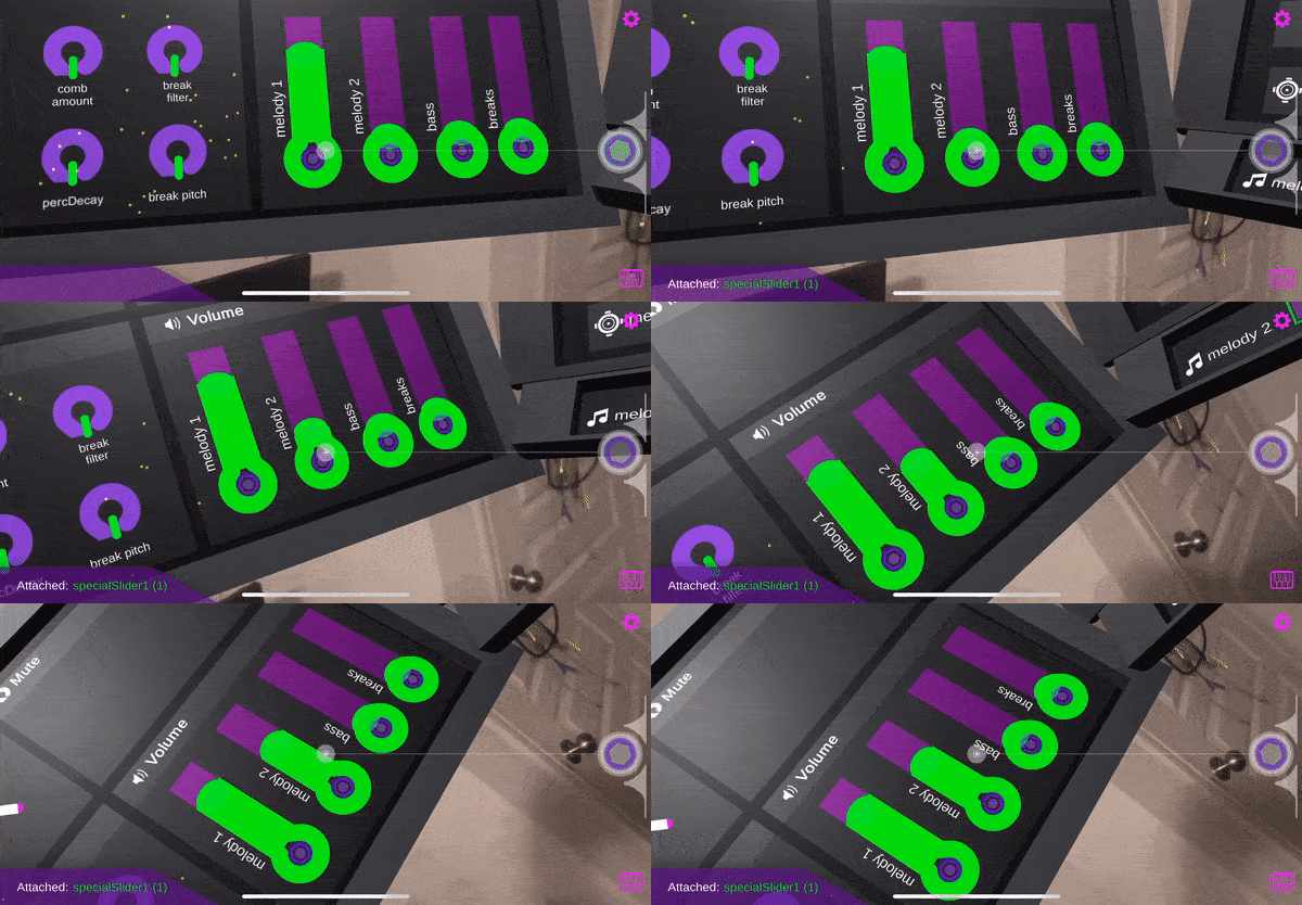
Now, a player can use the familiar action of toggling from the right (or left) center, much like taking a photo. So long as you are holding the toggle, you will stay attached to the UI element you are interacting with. Gaze center is where I determined it best to send the raycast to the UI, but proved to be a bit confusing understanding that the toggle was associated with the center reticle. I added a thin line that renders from the toggle to the center to assist in giving a more clear indicator that the two are related. I’m giving myself bonus points for making the line animate to the music. 😉
The other unintended benefit of this approach is that now a user can attach to a UI element from much further away. Having a clear center reticle makes it much more precise in selecting your interaction point.
Most every music interaction in Broken Place AR can be accomplished with a knob like z rotation. Sliders were a bit difficult in translating the Z rotation to a value because of how thin they were. I added sudo knobs on the bottom of the sliders to allow a wider hit point for attaching to the element. Visually, it just kinda makes more sense.
Explaining the Unity side in a tweet length description:
Each UI item has a box collider. When the main toggle is pressed, a raycast is sent from center reticle and hits the collider. The name of the collider is stored while held and the the object’s child knob’s (or slider’s) value increases/decreases based on the z rotation of the camera.
Lefty FTW!
I’m left handed. No way I’m going to ignore my lefties! I added a setting to flip the landscape orientation and align the toggle to the opposite side.
Beta Signup
I am very close to a public ready beta. If you would like to be notified when beta is ready, please sign up for the newsletter at http://broken.place
Leave a Reply